I turned my physical personal seal into a digital one (and it was way easier than I expected)
It felt as if signing my art made it less "good" and I wanted to change that.
In my very effective online searching for "how make signature not bad" I was immediately introduced to the idea of a "chop.". Chops are personal seals used for centuries in China and Japan as a way to official sign documents, identify art, and otherwise apply identity to a thing that could move around in the world.
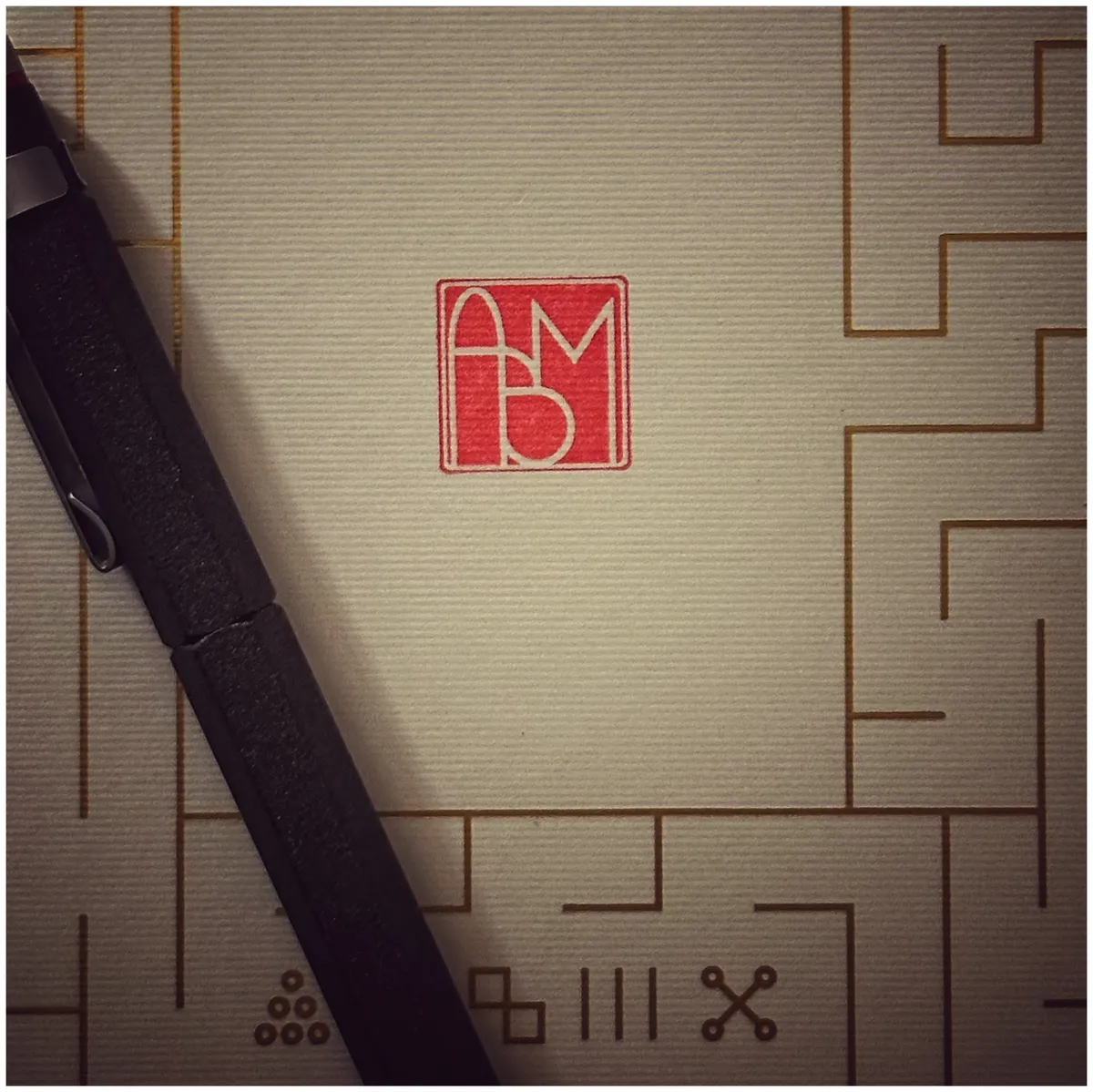
Let me tell you, I had no idea what those little red sigils were in some of my favorite art. [https://upload.wikimedia.org/wikipedia/commons/1/1c/Hokusai_as_an_old_man.jpg](Check out this seal on a self portrait Hokusai), the artist of The Great Wave. But understanding that history honestly made me feel a little bit less awful about wanting something different than my signature to sign things. At the time1 I had been using the "more professional" version of my online handle - ABMann - so I took the initials to create my seal2.


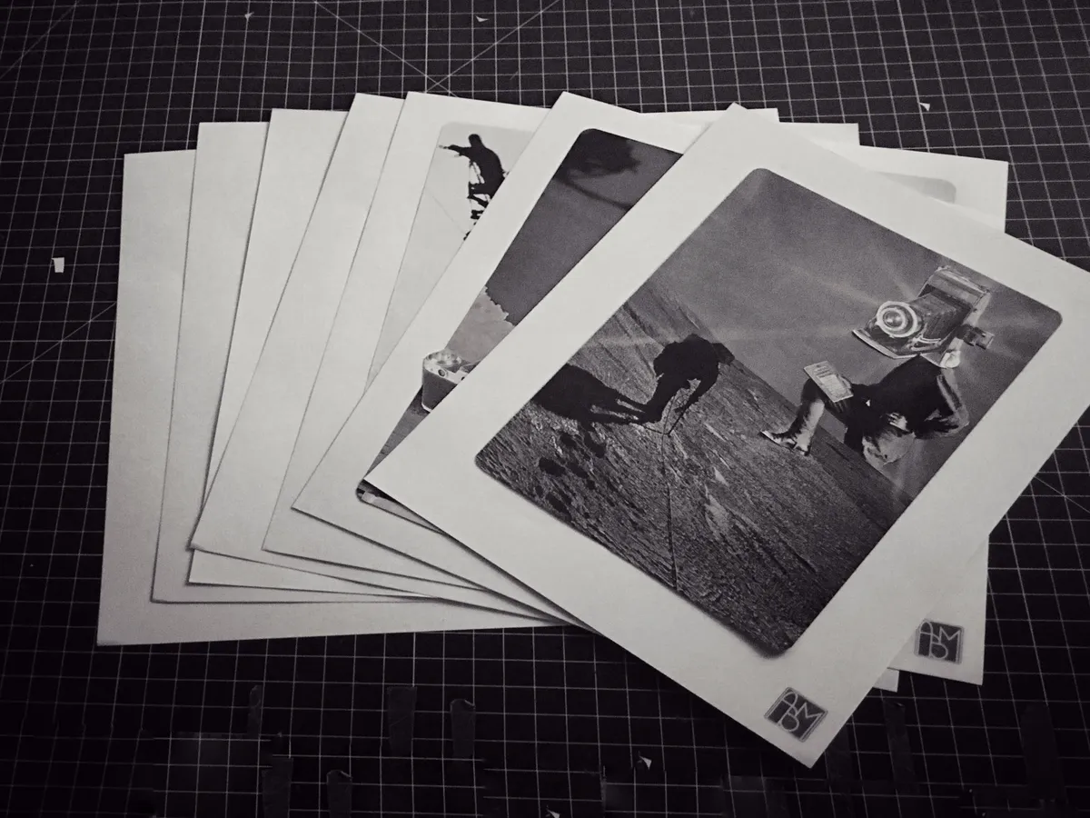
That seal appears at the end of my journal entries3 and the art (pictured above). While doing this, I asked myself, "why don't I have a digital version if this?". And the answer? Zero reason. So I made one.
A digital seal
Rather than just using the JPG of the stamp I originally made, I wanted something more flexible and accessible than a static image. CSS is so powerful these days that it ended up being dead simple to make this. The hard part was getting the letters to look how I wanted them to — I knew I wasn't going to make it perfect but could get close.
So I started with the letter — ABM — and isolated each letter so I could tweak the presentation. I needed a container to style to get the background and border and then containers to tweak the individual letters. Here's what it looks like.
<div class="chop">
   <span class="chop-letter letter-a">A</span>
   <span class="chop-letter letter-b">B</span>
   <span class="chop-letter letter-m">M</span>
</div>
As far as weird internet widgets, this is pretty straight forward. The CSS is less so....
/* seal css */
.chop {
  display: inline-flex;
  height: 25px;
  width: 25px;
  border: 6px double var(--background-color);
  border-radius: 9px;
  background-color: var(--accent-color);
  padding: .75em .75em .75em .75em;
  color: var(--background-color);
  font-family: 'Vibes', cursive;
  transform: rotate(-5deg);
  box-shadow: 2px 2px 0px var(--shadow);
  user-select: none;
}

/* Individual Letter Styling */
.chop-letter {
  display: inline-block;
  line-height: 1;
  margin: -.20rem 0.05em -.5rem;
  transition: all 0.3s ease;
}

/* Adjust per-letter size and spacing */
.letter-a {
  font-size: 2.25rem;
  letter-spacing: -0.19em;
  transform: rotate(-1deg);
  margin-left: -.6rem;
  rotate: 10deg;
}

.letter-b {
  font-size: 2.25rem;
  letter-spacing: -0.2em;
  transform: rotate(.8deg);
  padding-top: .12rem;
}

.letter-m {
  font-size: 1.75rem;
  letter-spacing: -0.3em;
  transform: rotate(-1deg);
  padding-top: .3rem;
  font-weight: bold;
}
Each letter needed tweaking in size, rotation, and weight in order to approximate the visuals I had in the physical seal. So that means I can adjust it over time AND it responds to theming changes (go ahead and switch the toggle in the sidebar if you're not on mobile). So right now, it will always use the defined --accent-color in my themes.
The result?
This little guy!
I can scale it:
I can recolor it:
And I gueeeesssss I can straighten it:
All I need to do is change the inline styling for the container to do most of the tweaking I may want to do post-to-post. Also, I canted it because I could and also I very carefully don't cant it on any physical object I seal. So now I have a little digital seal to go along with my physical seal. It's very flexible and, since its just HTML and CSS, pretty accessible.
Neat.
Footnotes
I was trying to build two side hustles - a wedding photography business and a bondage rope business. Only one of them was "successful".↩
I do not, unfortunately, have documentation of the typeface I started with.↩