Glow Cards - Blaugust the Twenty-fifth
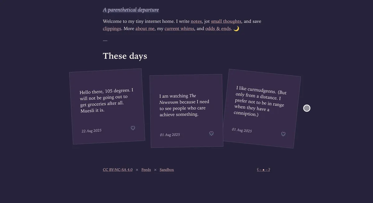
I happened upon Sylvia's blog and was consumed by the corkboard styling of her notes. I had to have it and, as is my ravenous wont, I bestowed upon it an eerie glow. As we do around here.

Below is how to do it entirely with CSS. It respects prefers-reduced-motion as well because accessibility matters.
What this does
- Adds a soft, pulsing glow to each blog card using a defined accent color.
- Respects accessibility: if a visitor prefers reduced motion, the animation disables automatically.
Assumptions
Your cards are list items in a blog posts list. If your HTML differs, tweak the selector below.
<ul class="embedded blog-posts">
  <li>Post A…</li>
  <li>Post B…</li>
  <li>Post C…</li>
</ul>
CSS (glow + animation + accessibility)
This uses your existing --accent-color theme variable. If you don't have one, you can define it on :root. If you do, it'll work and, here, respects dark/light mode selection.
(e.g., --accent-color: #92ff36;).
/* The breathing glow animation */
@keyframes breathing-glow
{
  0%, 100% {
    box-shadow: 0 0 0.3em var(--accent-color);
  }
  50% {
    box-shadow: 0 0 1em var(--accent-color);
  }
}

/* Apply the animation to each card */
body:not(.home) ul.embedded.blog-posts li
{
  --breath-duration: 6s;    /* shared duration */
  animation: breathing-glow var(--breath-duration) ease-in-out infinite;
  border-radius: 0.5rem;
}

/* Accessibility: respect reduced motion */
@media (prefers-reduced-motion: reduce)
{
  body:not(.home) ul.embedded.blog-posts li {
    animation: none;
  }
}
Variations (optional)
Hover/focus only: if you want the glow to breathe only when someone hovers or keyboards into a card:
body:not(.home) ul.embedded.blog-posts li { animation: none; }
body:not(.home) ul.embedded.blog-posts li:is(:hover, :focus-within) {
  animation: breathing-glow var(--breath-duration, 6s) ease-in-out infinite;
  animation-delay: var(--breath-delay, 0s);
}
Static border, animated shadow: If the glow feels too strong, add a subtle border and reduce the shadow range in
@keyframes- (e.g.,
0.2emto0.6em).
- (e.g.,
Theme-aware glow: If you use light/dark themes, you can adapt intensity with a variable:
:root[data-theme="light"] { --glow-max: 1em; }
:root[data-theme="dark"]  { --glow-max: 0.8em; } /* slightly calmer at night */
@keyframes breathing-glow {
  0%, 100% { box-shadow: 0 0 0.3em var(--accent-color); }
  50%      { box-shadow: 0 0 var(--glow-max, 1em) var(--accent-color); }
}
Troubleshooting
- No glow at all? Make sure
--accent-coloris defined (e.g., in:root[data-theme='light']and:root[data-theme='dark']). - Still or jerky animation? Check if your OS/browser has Reduced Motion enabled; the CSS disables the animation for those users.
- Selector mismatch? Verify your HTML structure and adjust
body:not(.home) ul.embedded.blog-posts liaccordingly.
Why this is accessible
- Respects user choice: If someone has motion reduced in their system settings, we fully disable the animation.
- No essential info conveyed by animation: The glow is decorative; no content is lost by turning it off.
- Keyboard users included: With the hover/focus variation, the effect appears when tabbing into a card too.
If you are here, you can see it at the bottom of this scrawl. Here also, all reading Eye, is a demonstration of the accessibility settings controlling it, like a helpful assistive puppet.
Happy glowing. May your corkboard breathe---softly, strangely, and with unending persistence.